MicroSec OT/IoT Cybersecurity Platform

OVERVIEW

A product-design deep dive into MicroSec's OT/IoT cybersecurity platform — MicroIDS, CyberAssessor and LCMS. Deconstructing the design system, component library and screen architecture that let a plant engineer triage a cyberattack at 3 a.m.

YEAR

2025

ROLE

Product Designer — end-to-end: research, design system, UI, data visualization

About the project

The design brief — design for the operator, defend the network. MicroIDS is an intrusion-detection console for industrial networks: ships, factories, power plants. Its users are OT engineers first, security analysts second. Every screen compresses deep technical state — network topology, ML anomaly scores, CVEs, compliance controls — into decisions a non-specialist can make quickly and safely. The interface is itself a security control: if the operator misreads the screen, the design has failed exactly when it mattered most.

The token layer. The design system runs on a 4-step neutral elevation ramp (sidebar #0B0B0B, canvas #161616, card #1F1F1F, elevated #282828), a single interactive accent (cyan #25AEE4) and a strict semantic scale: red #EF5350 for threats, orange #F5A032 for warnings and scores, green #2BB673 for compliant. Cyan is the only high-visibility hue with no alarm connotation, so it safely means "interactive" everywhere. Typography inverts marketing convention — threat scores and counts get 44px+ bold numerals while headings stay at 13px: in a monitoring tool, data outranks labels.

Screen anatomy — the network map. The canonical MicroIDS screen pairs a force-directed topology with a triage panel. Compromised nodes glow with a soft red halo, visible across a control room before reading a word. Map and list stay side by side so the same incident is visible spatially and textually at once.

The dashboard answers three questions in order: how bad (an orange 7/10 gauge), is it getting worse (a multi-series timeline), and what exactly (severity-colored counts where the numeral itself is the status indicator). Tabs — Device, Threat, Compliance — split audiences, not features.

Threat detail moves from alarm to explanation to action: plain-language description first, MITRE technique chip one click deeper, status as a red outline chip that never out-shouts severity.

CyberAssessor renders compliance as a scorecard: a display-size 58% posture score, IEC 62443 foundational requirements listed verbatim the way auditors navigate, a distribution donut and a criticality scatter that risk-weights non-compliant devices.

LCMS applies the same language to device identity — certificate lifecycles in operator vocabulary (enroll, renew, revoke, retire) with X.509 plumbing one level down. Same shell, same tokens: three products, one console.

Five patterns hold it together: verb-based navigation (Overview, Identify and Manage, Detect, Evaluate, Respond), score-first hierarchy, a severity color contract, progressive expertise, and spatial-plus-tabular duality.

Reflection. Restraint is a feature — one accent and three semantic colors are what make the red halo impossible to miss. Hierarchy should mirror the order of questions: How bad? Is it getting worse? What exactly? What do I do? And a design system is a promise across products — shared tabs, chips and severity colors are what turn three tools into one console.

Problem

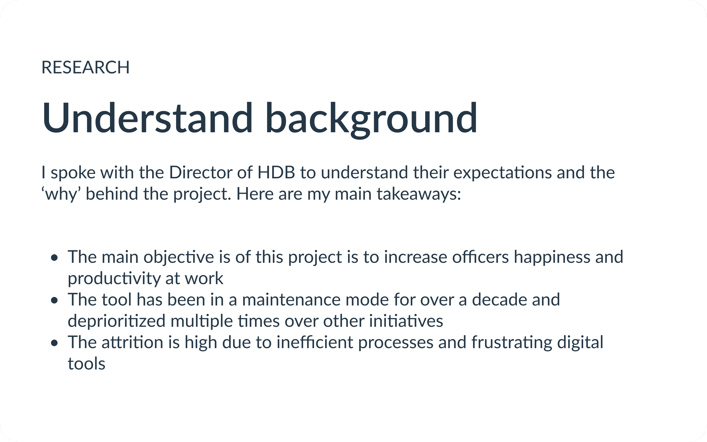
There’s almost a million of parking spaces in Housing & Development Board (HDB) estates across Singapore. HDB has been relying on a legacy digital system that has not been iterated on for over a decade. Officers overseeing the parking infrastructure have been dissatisfied with the manual processes and unreliable user experience. With increasing demands on parking management and evolving technological capabilities, there was a clear need to modernize the system.

Highlights

Design efforts contributed to improved user satisfaction by over 20% and reduced time spent on manual and mundane tasks by 27%

Discovery

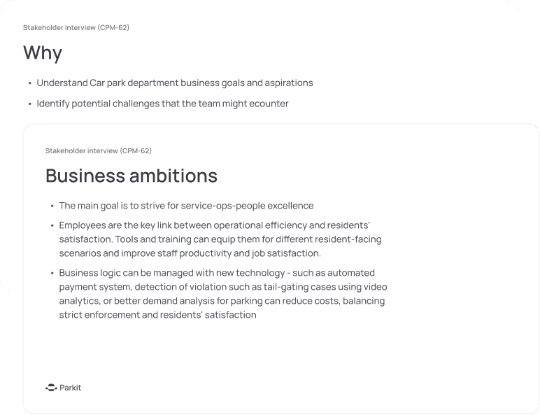
Stakeholder Interviews

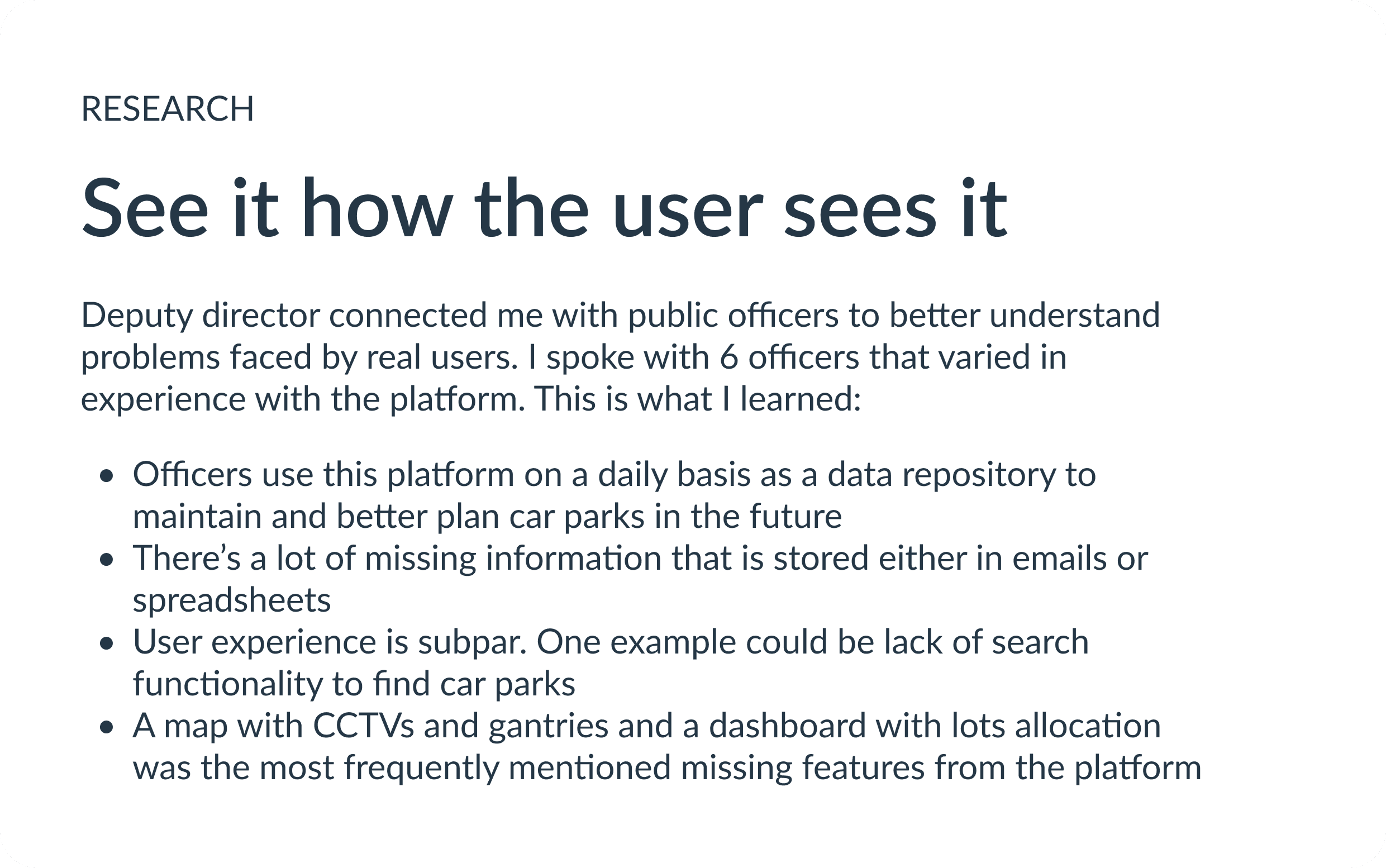
User Interviews

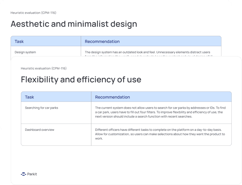
Heuristic evaluation

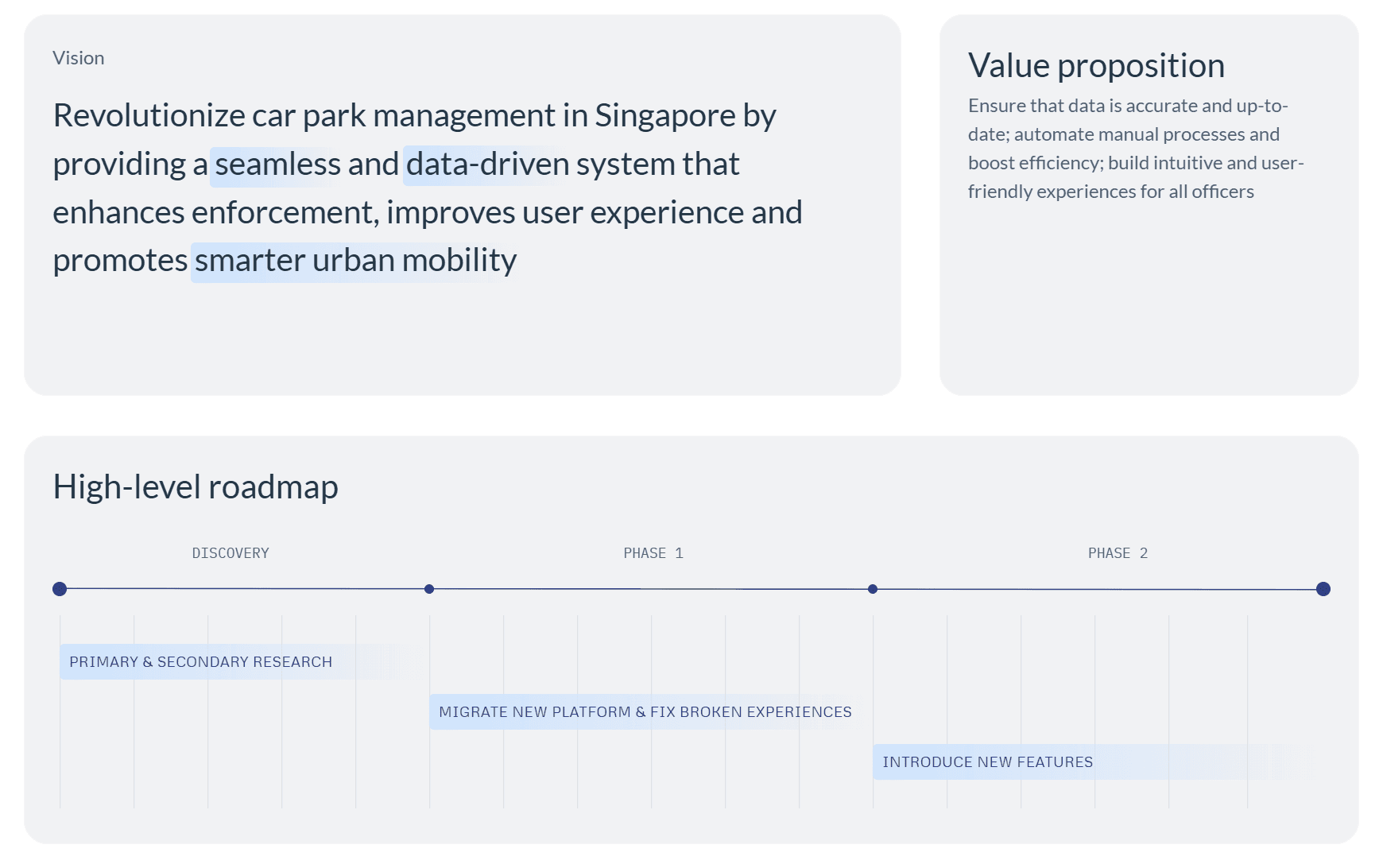
Strategy

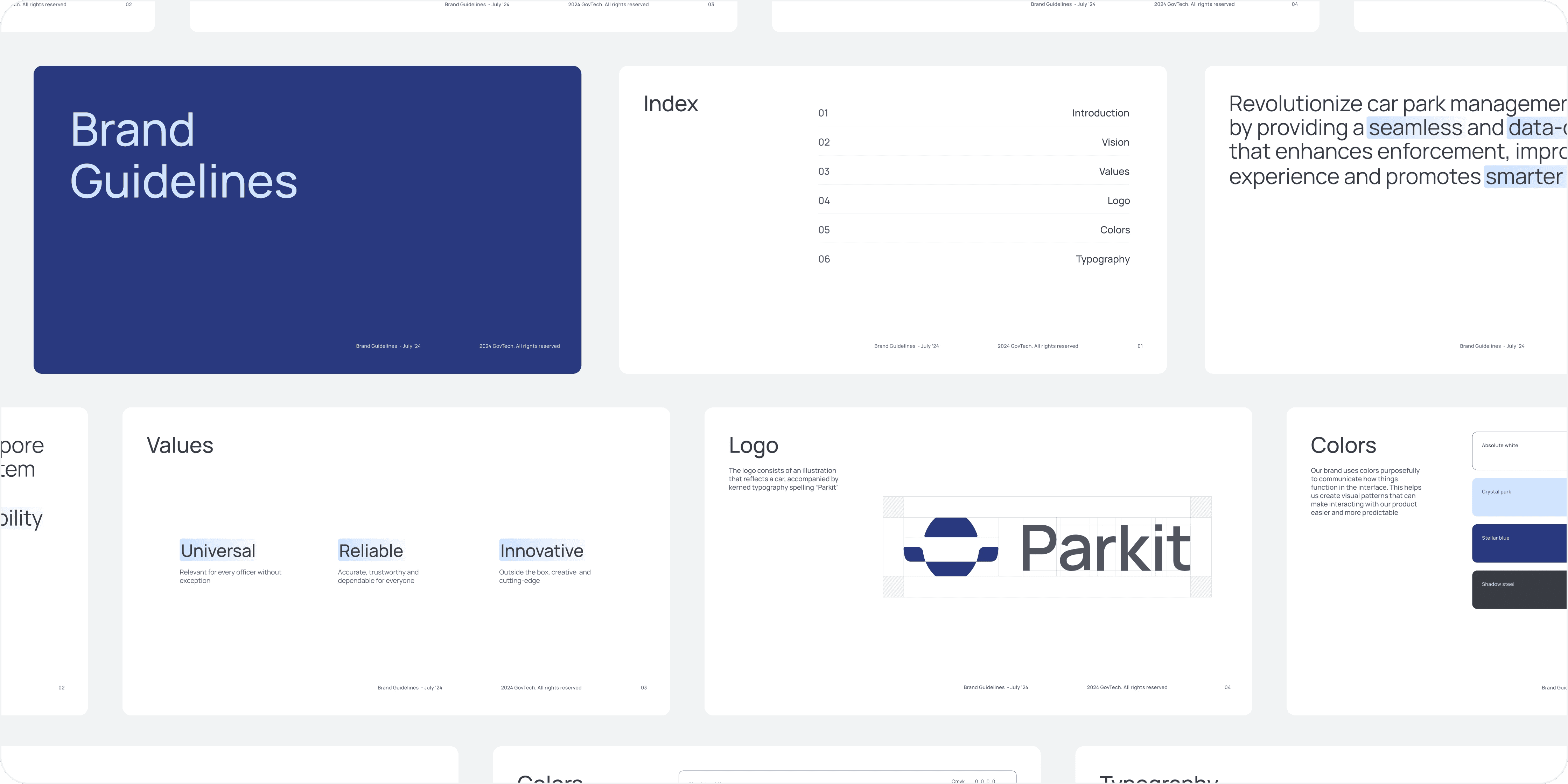
Guidelines & libraries

Brand Expressions

Design System

Design

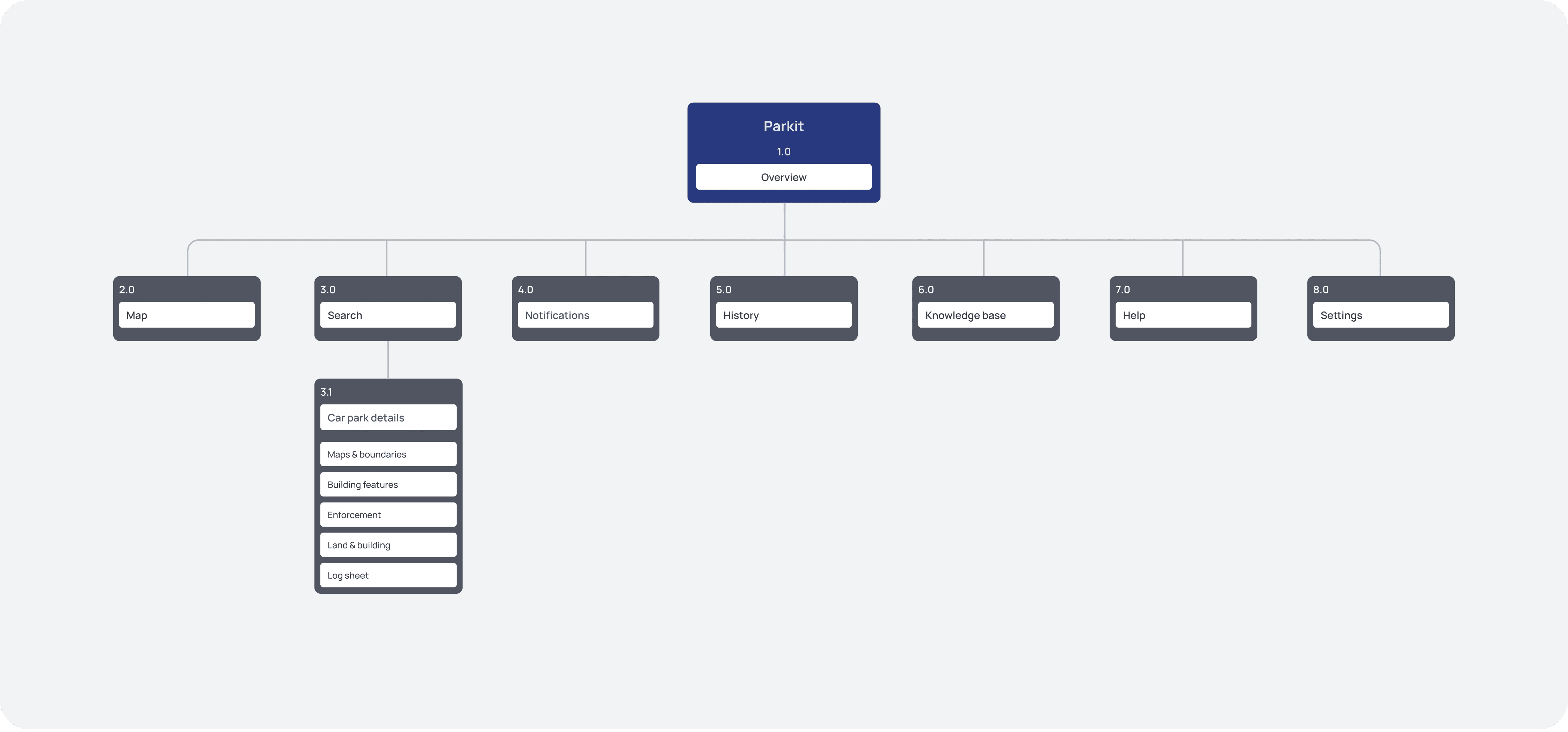
Information Architecture

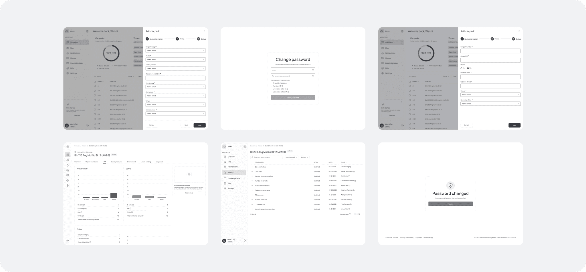
User Flow & wireframe

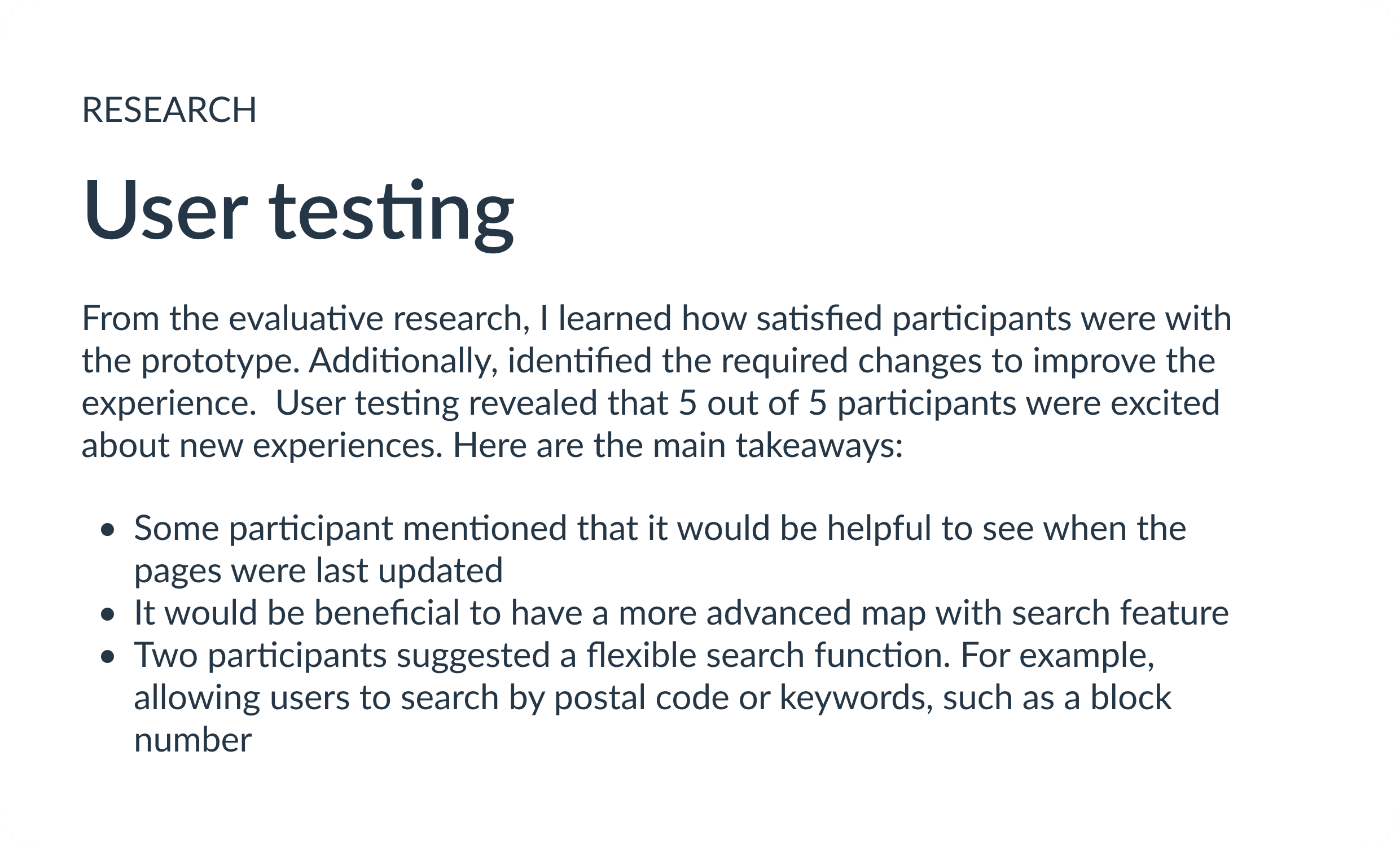
Evaluative research

Phase 1

Phase 2

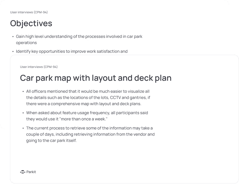
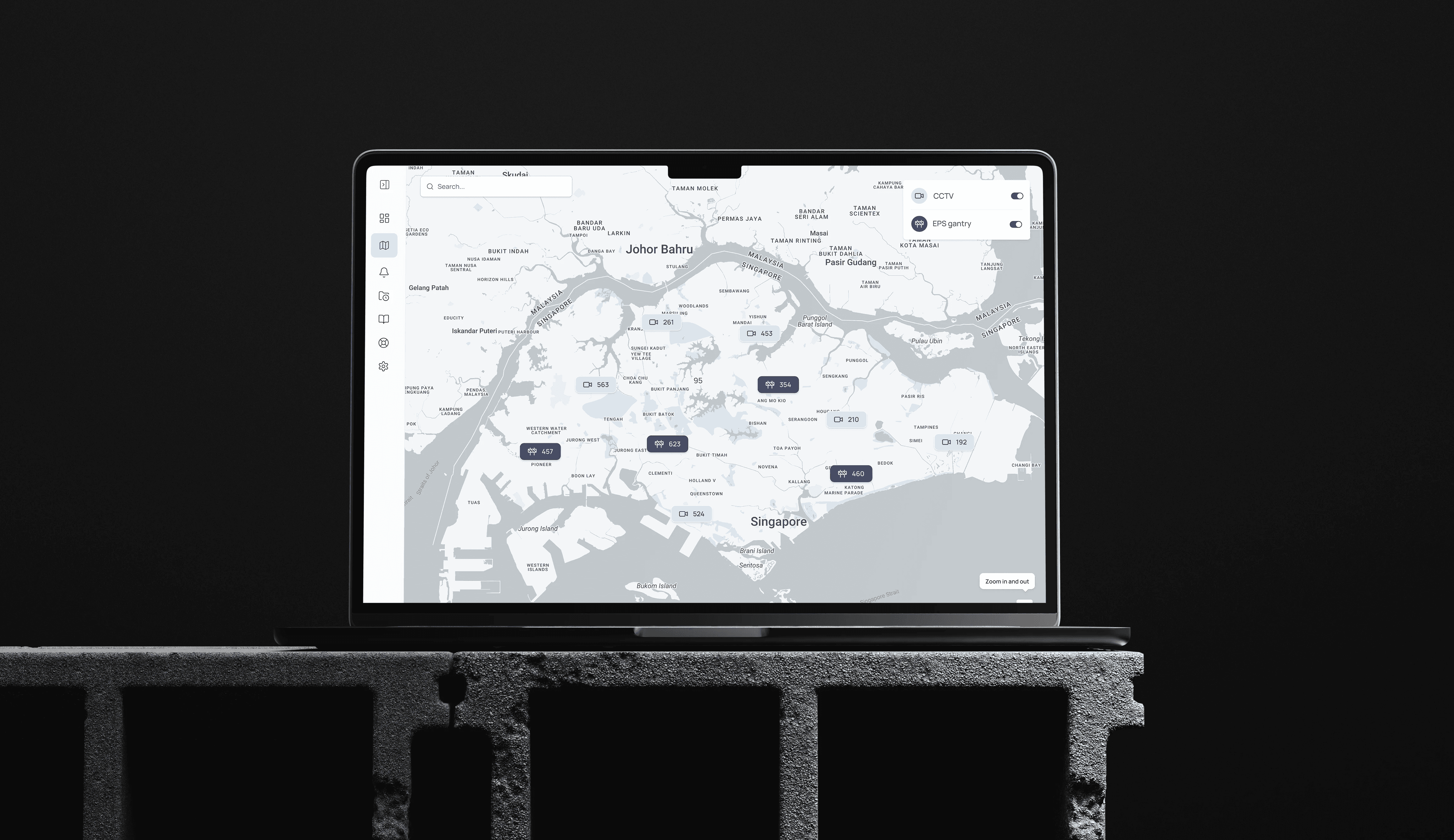
Map: Before implementation, officers relied on pdf maps or had to visit specific car parks to determine where CCTVs and gantries were located

Lots allocation

There are many types of parking lots, and officers reported that there was no overview of what kinds of lots specific car parks have

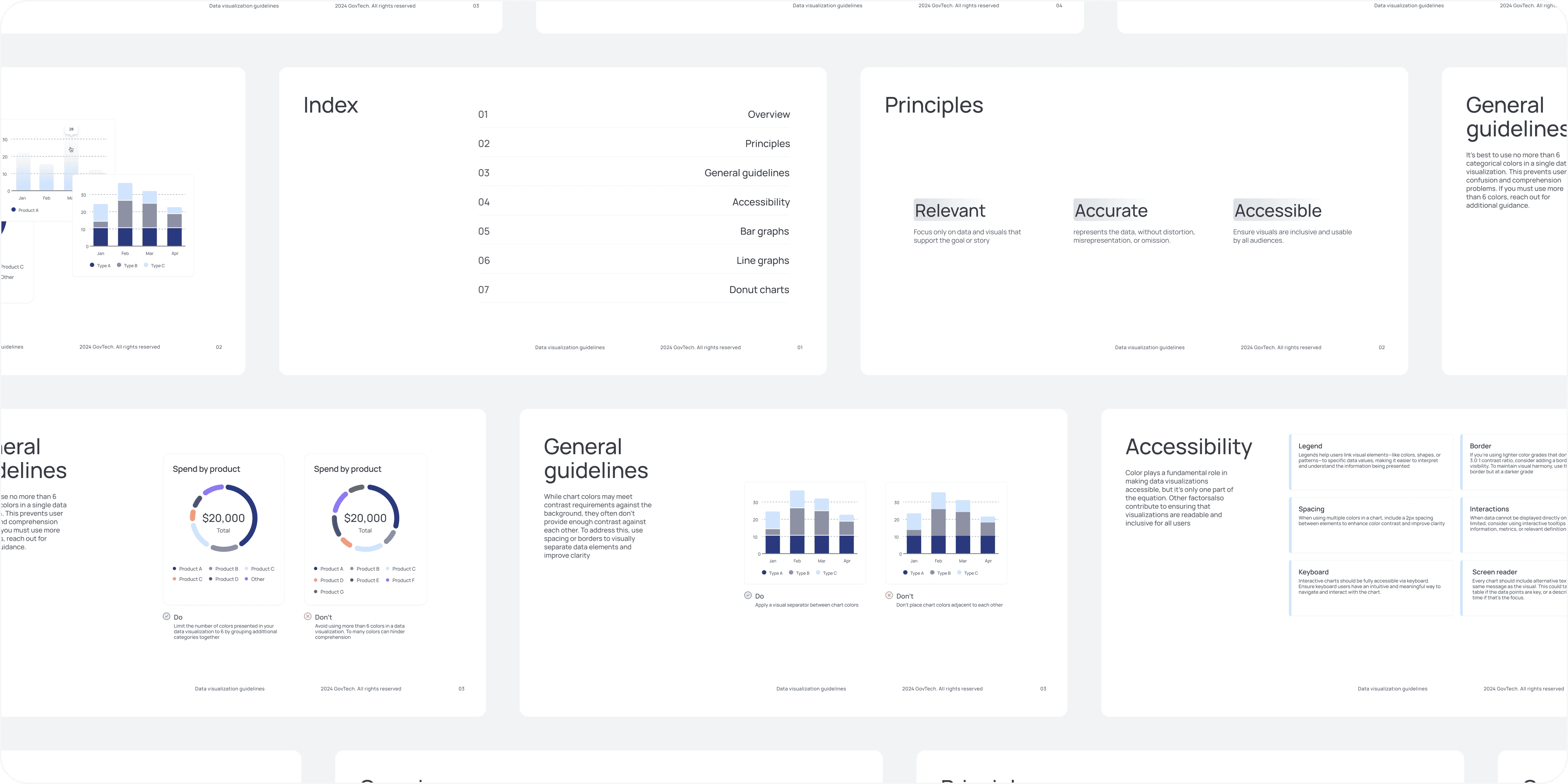
Data visualization

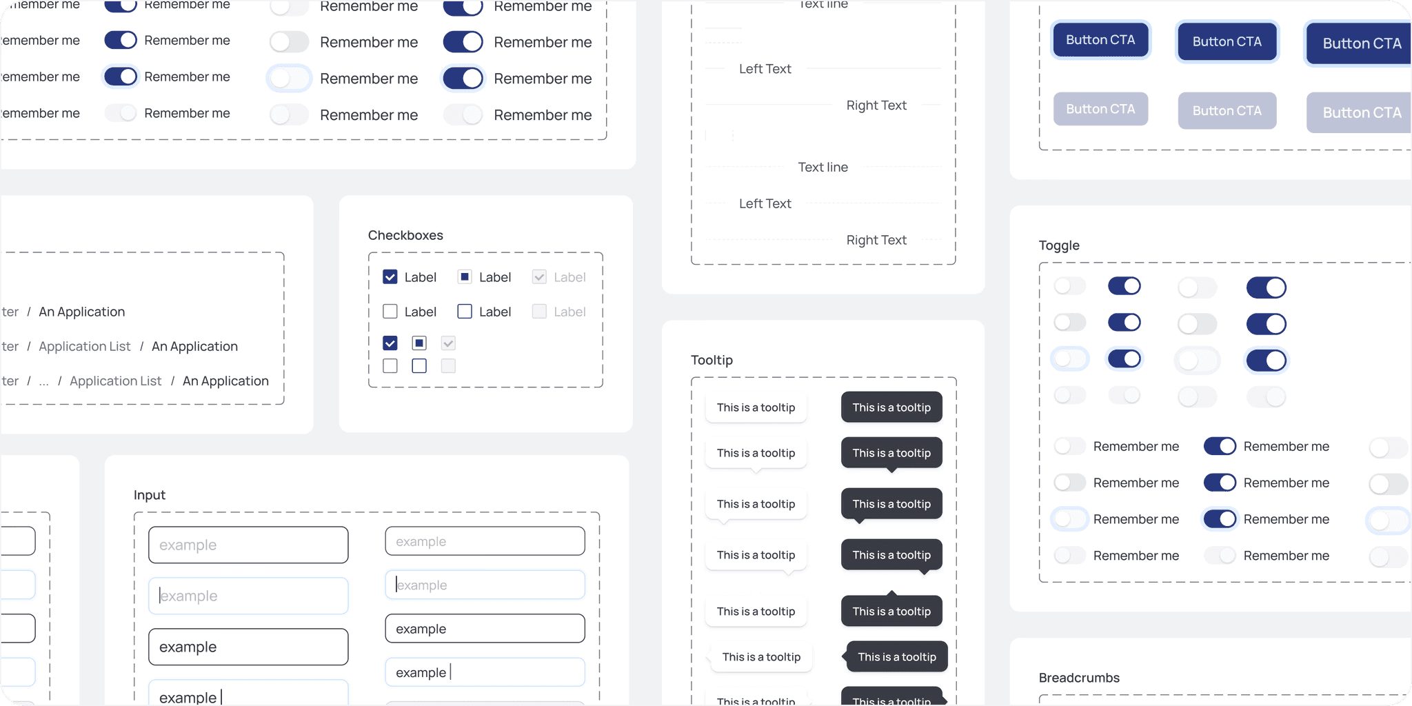
To improve consistency and efficiency of the design system,
I was responsible for creating new components that were used by other designers and engineers

Retrospective

What I would do differently: I would advocate for implementing sprint-based work during the discovery stage to better manage workload and deadlines. Instead, we only adopted sprints once engineering investigation and implementation began.

Lessons: This was my first project with a government client, and I discovered that government operations differ fundamentally from those of tech companies. While private sector projects are driven by business impact and scale, government projects prioritize public officers' and residents' satisfaction. Instead of focusing purely on business metrics, the emphasis is on creating smooth operations and positive experiences for both civil servants and residents.

Tradeoff: One of the calculated risks I helped the team decide on was using an open-source design system instead of building our own. I partnered with an engineering lead to choose the most flexible and usable option for our project. This approach allowed us to focus on solving real officers' problems rather than reinventing standard components. The team's velocity improved significantly, though we occasionally had to work around the design system's limitations to meet specific requirements.

MicroSec OT/IoT Cybersecurity Platform

OVERVIEW

A product-design deep dive into MicroSec's OT/IoT cybersecurity platform — MicroIDS, CyberAssessor and LCMS. Deconstructing the design system, component library and screen architecture that let a plant engineer triage a cyberattack at 3 a.m.

YEAR

2025

ROLE

Product Designer — end-to-end: research, design system, UI, data visualization

About the project

The design brief — design for the operator, defend the network. MicroIDS is an intrusion-detection console for industrial networks: ships, factories, power plants. Its users are OT engineers first, security analysts second. Every screen compresses deep technical state — network topology, ML anomaly scores, CVEs, compliance controls — into decisions a non-specialist can make quickly and safely. The interface is itself a security control: if the operator misreads the screen, the design has failed exactly when it mattered most.

The token layer. The design system runs on a 4-step neutral elevation ramp (sidebar #0B0B0B, canvas #161616, card #1F1F1F, elevated #282828), a single interactive accent (cyan #25AEE4) and a strict semantic scale: red #EF5350 for threats, orange #F5A032 for warnings and scores, green #2BB673 for compliant. Cyan is the only high-visibility hue with no alarm connotation, so it safely means "interactive" everywhere. Typography inverts marketing convention — threat scores and counts get 44px+ bold numerals while headings stay at 13px: in a monitoring tool, data outranks labels.

Screen anatomy — the network map. The canonical MicroIDS screen pairs a force-directed topology with a triage panel. Compromised nodes glow with a soft red halo, visible across a control room before reading a word. Map and list stay side by side so the same incident is visible spatially and textually at once.

The dashboard answers three questions in order: how bad (an orange 7/10 gauge), is it getting worse (a multi-series timeline), and what exactly (severity-colored counts where the numeral itself is the status indicator). Tabs — Device, Threat, Compliance — split audiences, not features.

Threat detail moves from alarm to explanation to action: plain-language description first, MITRE technique chip one click deeper, status as a red outline chip that never out-shouts severity.

CyberAssessor renders compliance as a scorecard: a display-size 58% posture score, IEC 62443 foundational requirements listed verbatim the way auditors navigate, a distribution donut and a criticality scatter that risk-weights non-compliant devices.

LCMS applies the same language to device identity — certificate lifecycles in operator vocabulary (enroll, renew, revoke, retire) with X.509 plumbing one level down. Same shell, same tokens: three products, one console.

Five patterns hold it together: verb-based navigation (Overview, Identify and Manage, Detect, Evaluate, Respond), score-first hierarchy, a severity color contract, progressive expertise, and spatial-plus-tabular duality.

Reflection. Restraint is a feature — one accent and three semantic colors are what make the red halo impossible to miss. Hierarchy should mirror the order of questions: How bad? Is it getting worse? What exactly? What do I do? And a design system is a promise across products — shared tabs, chips and severity colors are what turn three tools into one console.

Problem

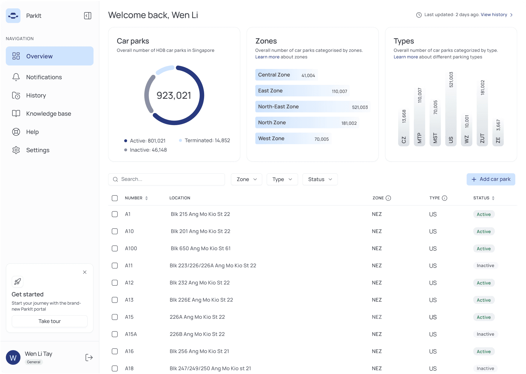
There’s almost a million of parking spaces in Housing & Development Board (HDB) estates across Singapore. HDB has been relying on a legacy digital system that has not been iterated on for over a decade. Officers overseeing the parking infrastructure have been dissatisfied with the manual processes and unreliable user experience. With increasing demands on parking management and evolving technological capabilities, there was a clear need to modernize the system.

Highlights

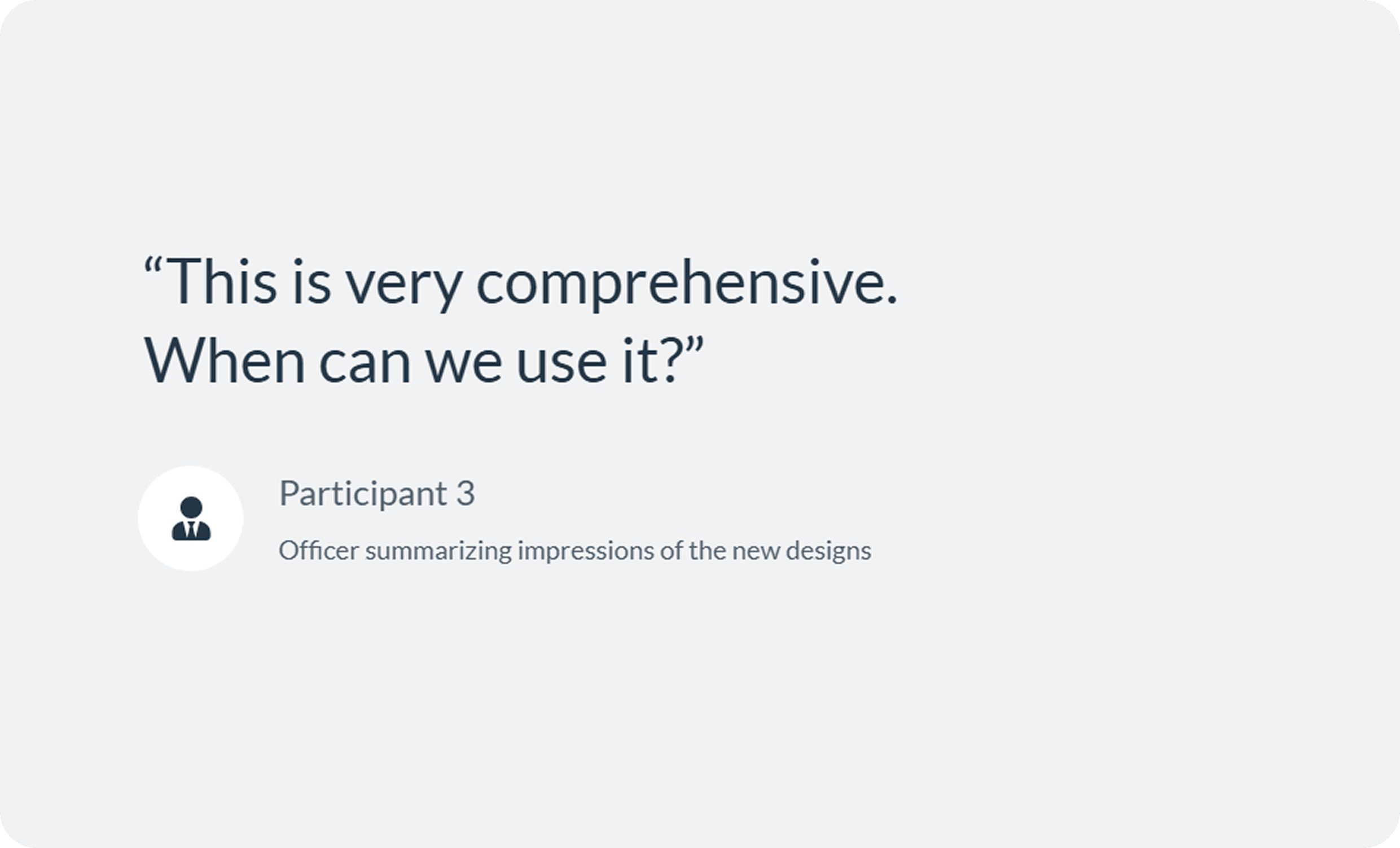
Design efforts contributed to improved user satisfaction by over 20% and reduced time spent on manual and mundane tasks by 27%

Discovery

Stakeholder Interviews

User Interviews

Heuristic evaluation

Strategy

Guidelines & libraries

Brand Expressions

Design System

Design

Information Architecture

User Flow & wireframe

Evaluative research

Phase 1

Phase 2

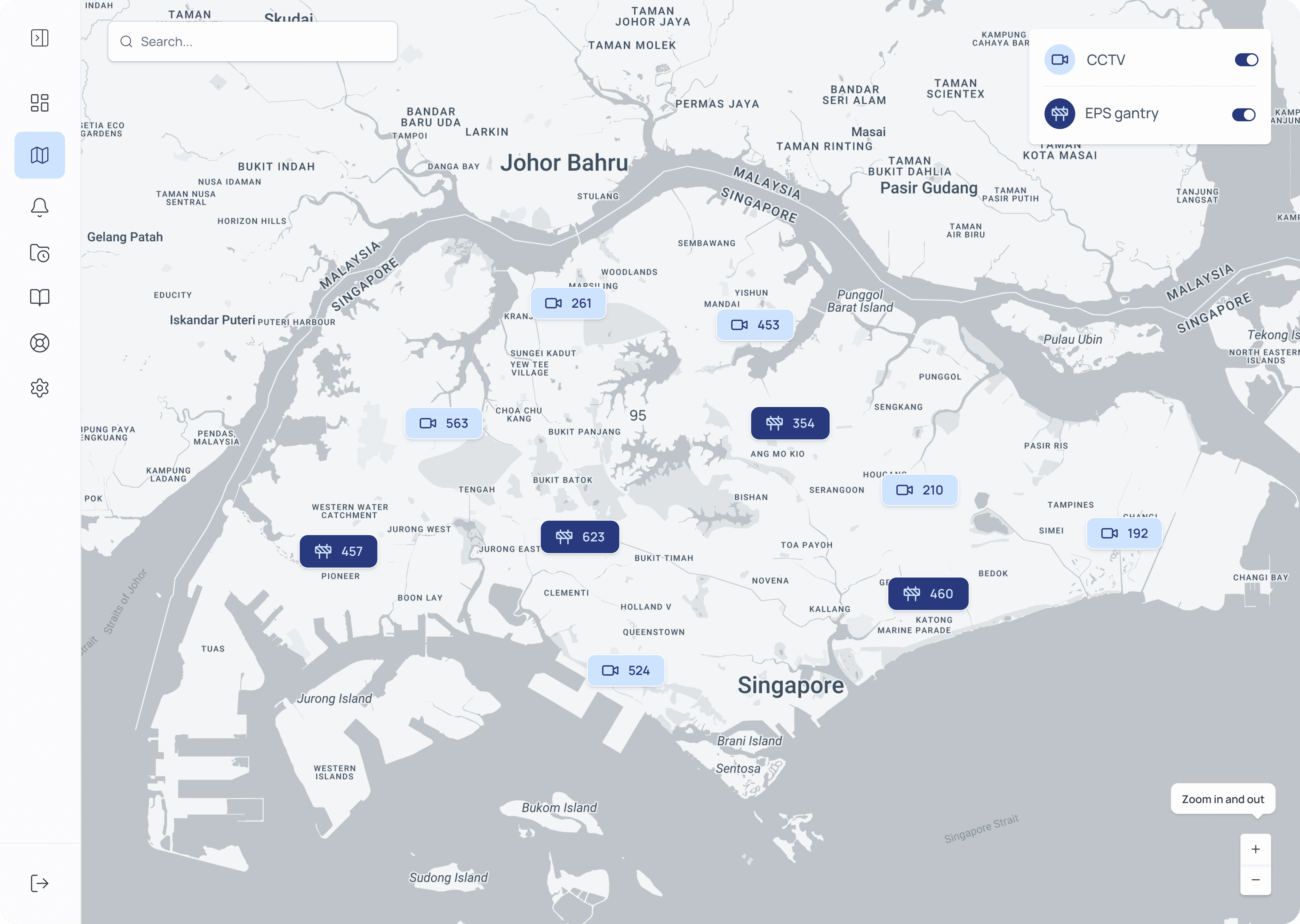
Map: Before implementation, officers relied on pdf maps or had to visit specific car parks to determine where CCTVs and gantries were located

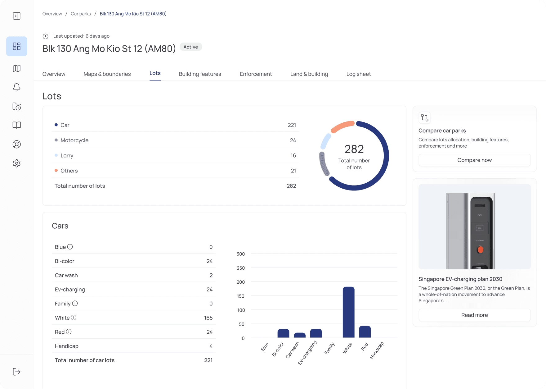
Lots allocation

There are many types of parking lots, and officers reported that there was no overview of what kinds of lots specific car parks have

Data visualization

To improve consistency and efficiency of the design system,
I was responsible for creating new components that were used by other designers and engineers

Retrospective

What I would do differently: I would advocate for implementing sprint-based work during the discovery stage to better manage workload and deadlines. Instead, we only adopted sprints once engineering investigation and implementation began.

Lessons: This was my first project with a government client, and I discovered that government operations differ fundamentally from those of tech companies. While private sector projects are driven by business impact and scale, government projects prioritize public officers' and residents' satisfaction. Instead of focusing purely on business metrics, the emphasis is on creating smooth operations and positive experiences for both civil servants and residents.

Tradeoff: One of the calculated risks I helped the team decide on was using an open-source design system instead of building our own. I partnered with an engineering lead to choose the most flexible and usable option for our project. This approach allowed us to focus on solving real officers' problems rather than reinventing standard components. The team's velocity improved significantly, though we occasionally had to work around the design system's limitations to meet specific requirements.

MicroSec OT/IoT Cybersecurity Platform

OVERVIEW

A product-design deep dive into MicroSec's OT/IoT cybersecurity platform — MicroIDS, CyberAssessor and LCMS. Deconstructing the design system, component library and screen architecture that let a plant engineer triage a cyberattack at 3 a.m.

YEAR

2025

ROLE

Product Designer — end-to-end: research, design system, UI, data visualization

About the project

The design brief — design for the operator, defend the network. MicroIDS is an intrusion-detection console for industrial networks: ships, factories, power plants. Its users are OT engineers first, security analysts second. Every screen compresses deep technical state — network topology, ML anomaly scores, CVEs, compliance controls — into decisions a non-specialist can make quickly and safely. The interface is itself a security control: if the operator misreads the screen, the design has failed exactly when it mattered most.

The token layer. The design system runs on a 4-step neutral elevation ramp (sidebar #0B0B0B, canvas #161616, card #1F1F1F, elevated #282828), a single interactive accent (cyan #25AEE4) and a strict semantic scale: red #EF5350 for threats, orange #F5A032 for warnings and scores, green #2BB673 for compliant. Cyan is the only high-visibility hue with no alarm connotation, so it safely means "interactive" everywhere. Typography inverts marketing convention — threat scores and counts get 44px+ bold numerals while headings stay at 13px: in a monitoring tool, data outranks labels.

Screen anatomy — the network map. The canonical MicroIDS screen pairs a force-directed topology with a triage panel. Compromised nodes glow with a soft red halo, visible across a control room before reading a word. Map and list stay side by side so the same incident is visible spatially and textually at once.

The dashboard answers three questions in order: how bad (an orange 7/10 gauge), is it getting worse (a multi-series timeline), and what exactly (severity-colored counts where the numeral itself is the status indicator). Tabs — Device, Threat, Compliance — split audiences, not features.

Threat detail moves from alarm to explanation to action: plain-language description first, MITRE technique chip one click deeper, status as a red outline chip that never out-shouts severity.

CyberAssessor renders compliance as a scorecard: a display-size 58% posture score, IEC 62443 foundational requirements listed verbatim the way auditors navigate, a distribution donut and a criticality scatter that risk-weights non-compliant devices.

LCMS applies the same language to device identity — certificate lifecycles in operator vocabulary (enroll, renew, revoke, retire) with X.509 plumbing one level down. Same shell, same tokens: three products, one console.

Five patterns hold it together: verb-based navigation (Overview, Identify and Manage, Detect, Evaluate, Respond), score-first hierarchy, a severity color contract, progressive expertise, and spatial-plus-tabular duality.

Reflection. Restraint is a feature — one accent and three semantic colors are what make the red halo impossible to miss. Hierarchy should mirror the order of questions: How bad? Is it getting worse? What exactly? What do I do? And a design system is a promise across products — shared tabs, chips and severity colors are what turn three tools into one console.

Problem

There’s almost a million of parking spaces in Housing & Development Board (HDB) estates across Singapore. HDB has been relying on a legacy digital system that has not been iterated on for over a decade. Officers overseeing the parking infrastructure have been dissatisfied with the manual processes and unreliable user experience. With increasing demands on parking management and evolving technological capabilities, there was a clear need to modernize the system.

Highlights

Design efforts contributed to improved user satisfaction by over 20% and reduced time spent on manual and mundane tasks by 27%

Discovery

Stakeholder Interviews

User Interviews

Heuristic evaluation

Strategy

Guidelines & libraries

Brand Expressions

Design System

Design

Information Architecture

User Flow & wireframe

Evaluative research

Phase 1

Phase 2

Map: Before implementation, officers relied on pdf maps or had to visit specific car parks to determine where CCTVs and gantries were located

Lots allocation

There are many types of parking lots, and officers reported that there was no overview of what kinds of lots specific car parks have

Data visualization

To improve consistency and efficiency of the design system,
I was responsible for creating new components that were used by other designers and engineers

Retrospective

What I would do differently: I would advocate for implementing sprint-based work during the discovery stage to better manage workload and deadlines. Instead, we only adopted sprints once engineering investigation and implementation began.

Lessons: This was my first project with a government client, and I discovered that government operations differ fundamentally from those of tech companies. While private sector projects are driven by business impact and scale, government projects prioritize public officers' and residents' satisfaction. Instead of focusing purely on business metrics, the emphasis is on creating smooth operations and positive experiences for both civil servants and residents.

Tradeoff: One of the calculated risks I helped the team decide on was using an open-source design system instead of building our own. I partnered with an engineering lead to choose the most flexible and usable option for our project. This approach allowed us to focus on solving real officers' problems rather than reinventing standard components. The team's velocity improved significantly, though we occasionally had to work around the design system's limitations to meet specific requirements.

Create a free website with Framer, the website builder loved by startups, designers and agencies.