Prift Finance Platform

OVERVIEW

Prift is a personal financial assistant that unites all of a person's finances in one place and forecasts them 10–30 years ahead — turning long-term goals like pensions, mortgages, and education into clear, achievable plans.

An image of a smartphone on top of an eletronic surface

YEAR

2023

ROLE

Lead Product Designer (UI/UX)

About the project

Financial stress is universal, yet the tools people rely on all fall short: budgeting apps stop at 1-year horizons, pension and investment platforms are siloed by asset type, and financial advisors aren't affordable for most. Prift closes that gap — one place to see, manage, and forecast all personal finances decades ahead. I led UI/UX design from discovery to a working MVP prototype: competitive and benchmark research, MoSCoW feature prioritization, and A/B-tested wireframes validated with users before any visual design.

The MVP shipped with four core features: personalized financial advice, savings efficiency comparison against industry benchmarks, goal tracking with monthly saving calculations, and debt & loan management. Post-MVP, I designed the "Make the most of your finance" flow around how people actually manage money (pay off debt, fund goals, then invest), plus an account comparison flow that removed the expertise barrier for users and unlocked a partner-offer revenue stream for the business.

The hardest constraint: UK regulation requires financial guidance to inform, never instruct. Every flow is choice-first, every forecast is worded as an "estimated result," and mortgage changes trigger a clear warning that the bank must approve any real modification — compliance designed in, not bolted on.
Problem

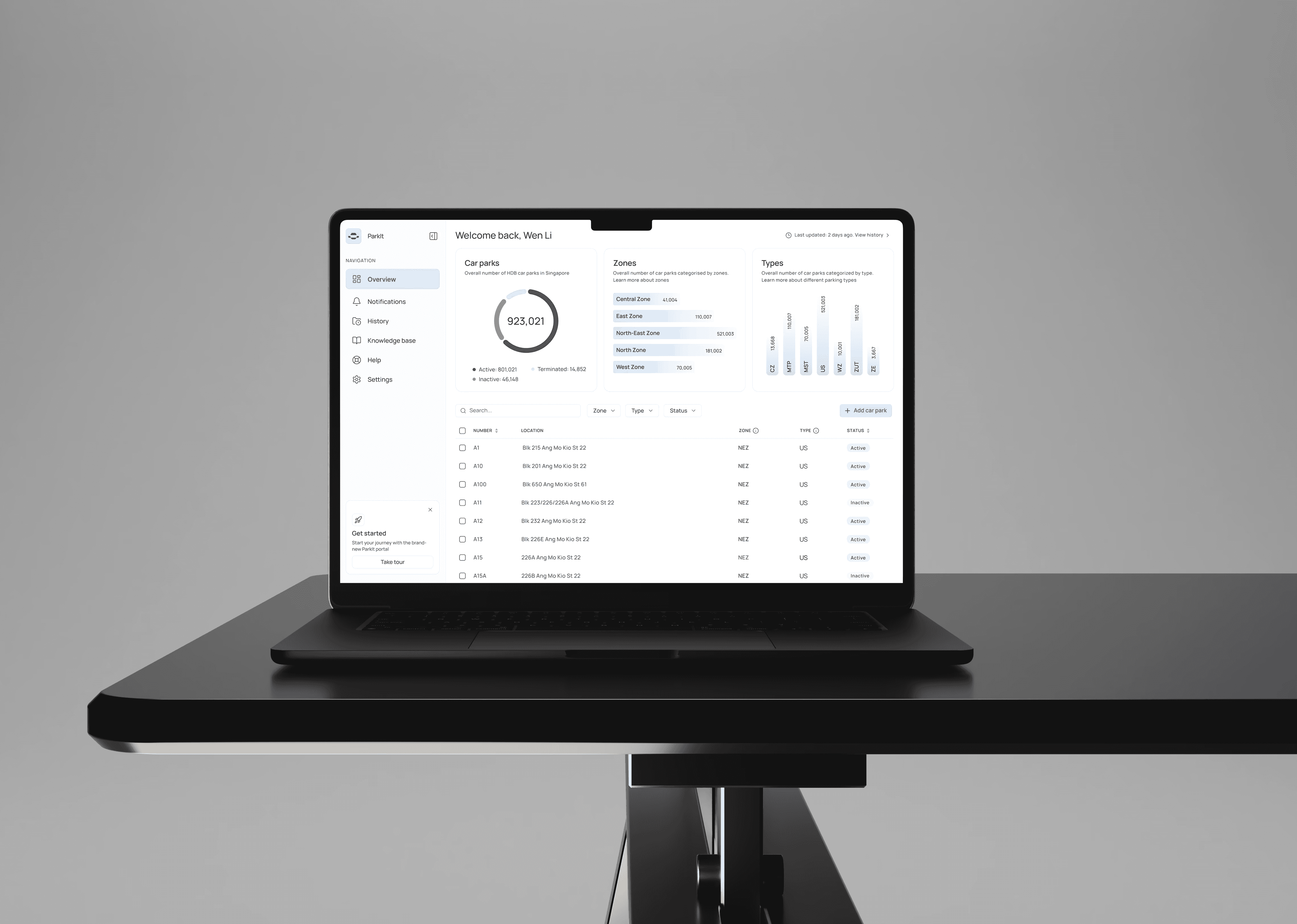
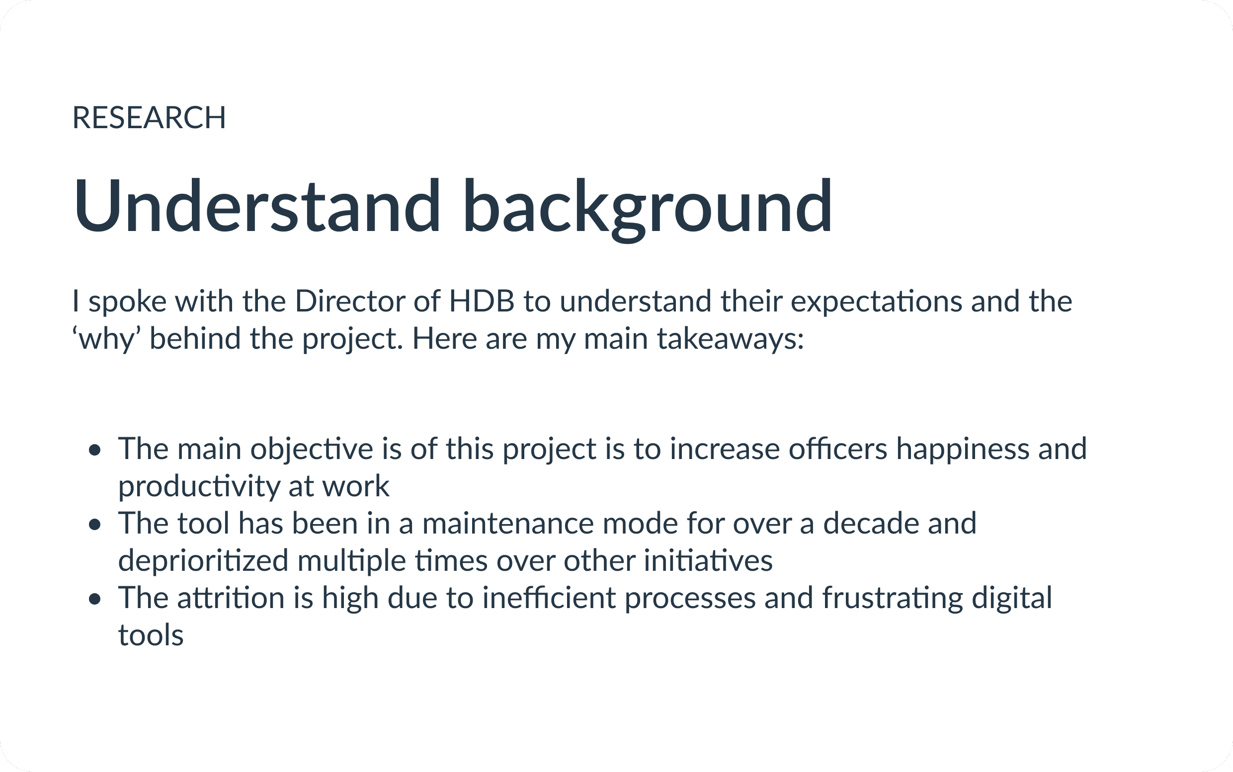
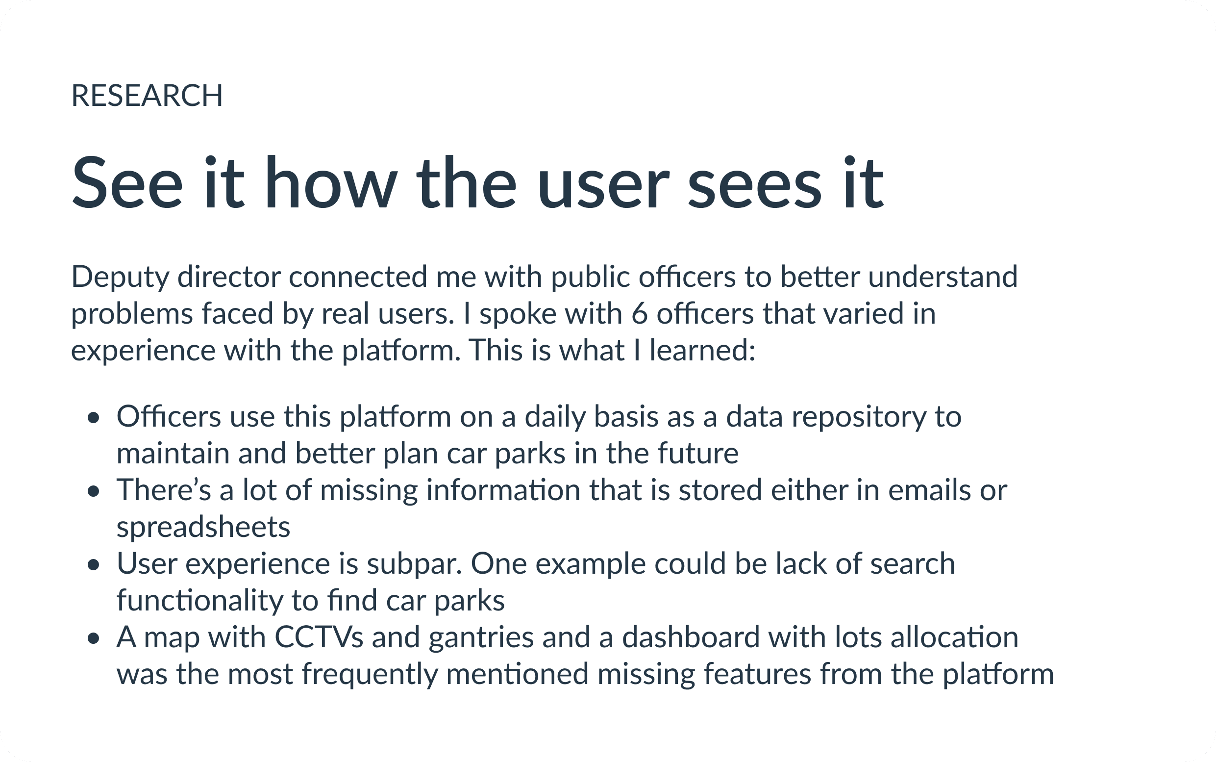
There’s almost a million of parking spaces in Housing & Development Board (HDB) estates across Singapore. HDB has been relying on a legacy digital system that has not been iterated on for over a decade. Officers overseeing the parking infrastructure have been dissatisfied with the manual processes and unreliable user experience. With increasing demands on parking management and evolving technological capabilities, there was a clear need to modernize the system.

Highlights

Design efforts contributed to improved user satisfaction by over 20% and reduced time spent on manual and mundane tasks by 27%

Discovery

Stakeholder Interviews

User Interviews

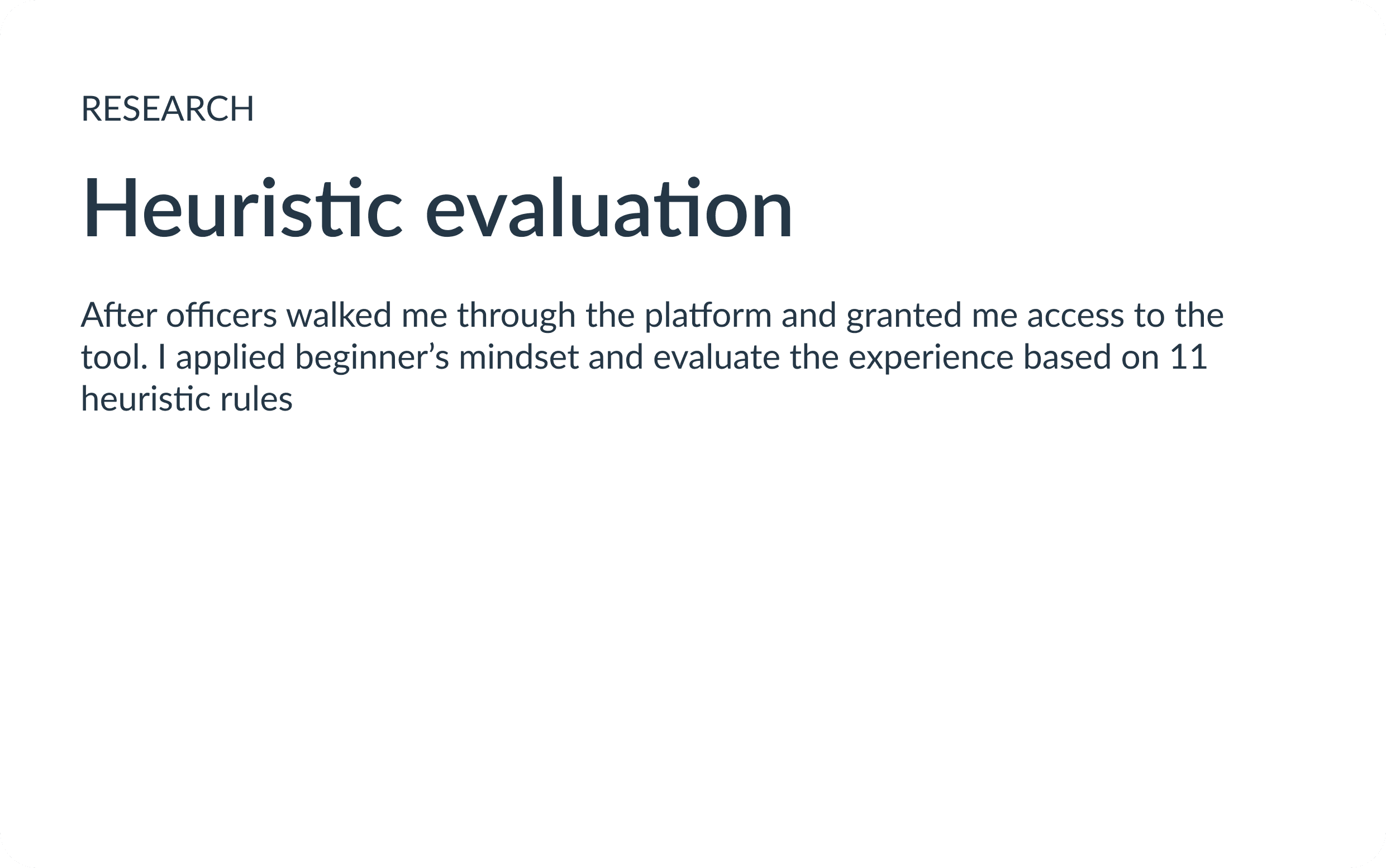
Heuristic evaluation

Strategy

Guidelines & libraries

Brand Expressions

Design System

Design

Information Architecture

User Flow & wireframe

Evaluative research

Phase 1

Phase 2

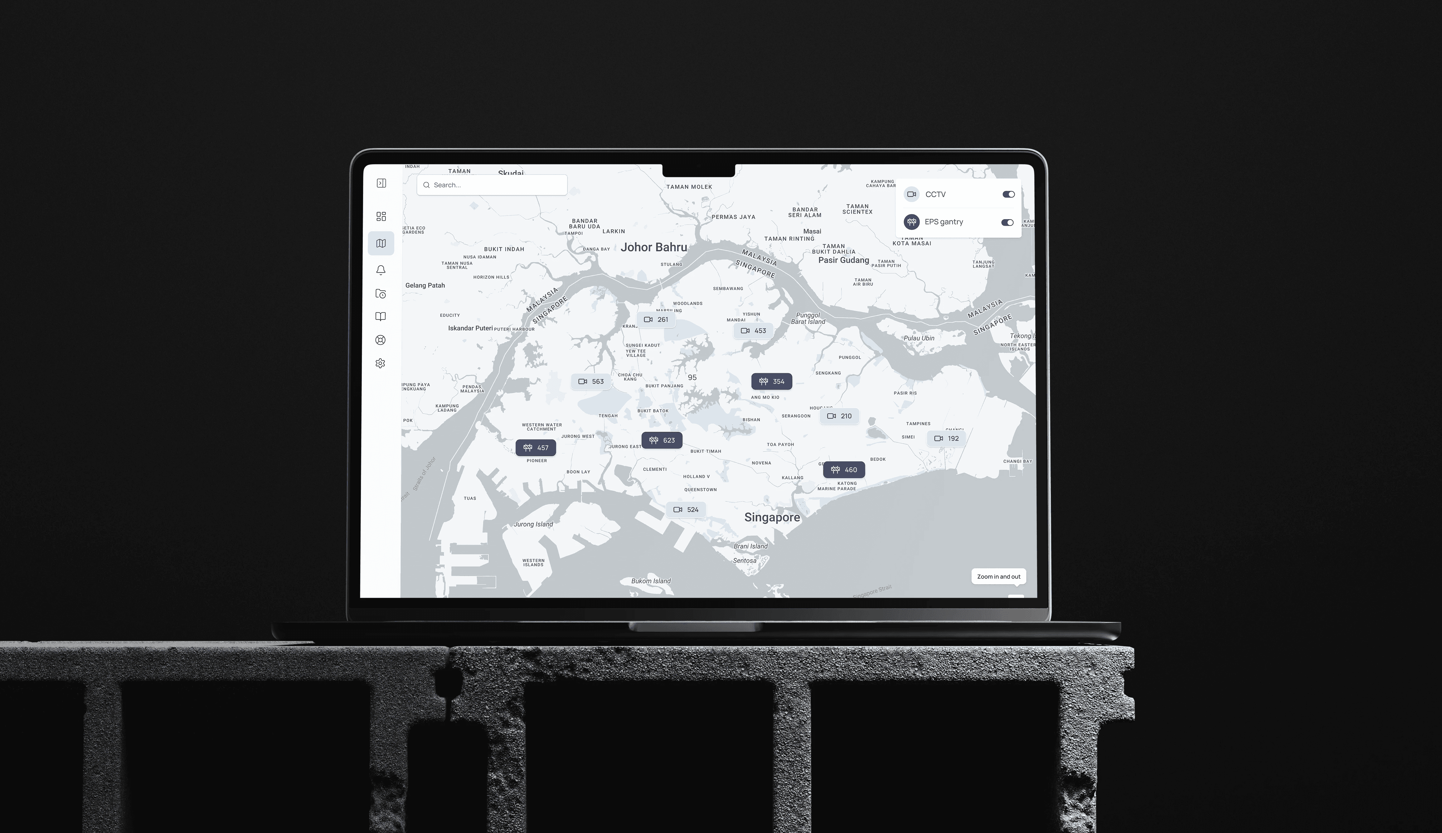
Map: Before implementation, officers relied on pdf maps or had to visit specific car parks to determine where CCTVs and gantries were located

Lots allocation

There are many types of parking lots, and officers reported that there was no overview of what kinds of lots specific car parks have

Data visualization

To improve consistency and efficiency of the design system,
I was responsible for creating new components that were used by other designers and engineers

Retrospective

What I would do differently: I would advocate for implementing sprint-based work during the discovery stage to better manage workload and deadlines. Instead, we only adopted sprints once engineering investigation and implementation began.

Lessons: This was my first project with a government client, and I discovered that government operations differ fundamentally from those of tech companies. While private sector projects are driven by business impact and scale, government projects prioritize public officers' and residents' satisfaction. Instead of focusing purely on business metrics, the emphasis is on creating smooth operations and positive experiences for both civil servants and residents.

Tradeoff: One of the calculated risks I helped the team decide on was using an open-source design system instead of building our own. I partnered with an engineering lead to choose the most flexible and usable option for our project. This approach allowed us to focus on solving real officers' problems rather than reinventing standard components. The team's velocity improved significantly, though we occasionally had to work around the design system's limitations to meet specific requirements.

Prift Finance Platform

OVERVIEW

Prift is a personal financial assistant that unites all of a person's finances in one place and forecasts them 10–30 years ahead — turning long-term goals like pensions, mortgages, and education into clear, achievable plans.

An image of a smartphone on top of an eletronic surface

YEAR

2023

ROLE

Lead Product Designer (UI/UX)

About the project

Financial stress is universal, yet the tools people rely on all fall short: budgeting apps stop at 1-year horizons, pension and investment platforms are siloed by asset type, and financial advisors aren't affordable for most. Prift closes that gap — one place to see, manage, and forecast all personal finances decades ahead. I led UI/UX design from discovery to a working MVP prototype: competitive and benchmark research, MoSCoW feature prioritization, and A/B-tested wireframes validated with users before any visual design.

The MVP shipped with four core features: personalized financial advice, savings efficiency comparison against industry benchmarks, goal tracking with monthly saving calculations, and debt & loan management. Post-MVP, I designed the "Make the most of your finance" flow around how people actually manage money (pay off debt, fund goals, then invest), plus an account comparison flow that removed the expertise barrier for users and unlocked a partner-offer revenue stream for the business.

The hardest constraint: UK regulation requires financial guidance to inform, never instruct. Every flow is choice-first, every forecast is worded as an "estimated result," and mortgage changes trigger a clear warning that the bank must approve any real modification — compliance designed in, not bolted on.
Problem

There’s almost a million of parking spaces in Housing & Development Board (HDB) estates across Singapore. HDB has been relying on a legacy digital system that has not been iterated on for over a decade. Officers overseeing the parking infrastructure have been dissatisfied with the manual processes and unreliable user experience. With increasing demands on parking management and evolving technological capabilities, there was a clear need to modernize the system.

Highlights

Design efforts contributed to improved user satisfaction by over 20% and reduced time spent on manual and mundane tasks by 27%

Discovery

Stakeholder Interviews

User Interviews

Heuristic evaluation

Strategy

Guidelines & libraries

Brand Expressions

Design System

Design

Information Architecture

User Flow & wireframe

Evaluative research

Phase 1

Phase 2

Map: Before implementation, officers relied on pdf maps or had to visit specific car parks to determine where CCTVs and gantries were located

Lots allocation

There are many types of parking lots, and officers reported that there was no overview of what kinds of lots specific car parks have

Data visualization

To improve consistency and efficiency of the design system,
I was responsible for creating new components that were used by other designers and engineers

Retrospective

What I would do differently: I would advocate for implementing sprint-based work during the discovery stage to better manage workload and deadlines. Instead, we only adopted sprints once engineering investigation and implementation began.

Lessons: This was my first project with a government client, and I discovered that government operations differ fundamentally from those of tech companies. While private sector projects are driven by business impact and scale, government projects prioritize public officers' and residents' satisfaction. Instead of focusing purely on business metrics, the emphasis is on creating smooth operations and positive experiences for both civil servants and residents.

Tradeoff: One of the calculated risks I helped the team decide on was using an open-source design system instead of building our own. I partnered with an engineering lead to choose the most flexible and usable option for our project. This approach allowed us to focus on solving real officers' problems rather than reinventing standard components. The team's velocity improved significantly, though we occasionally had to work around the design system's limitations to meet specific requirements.

Prift Finance Platform

OVERVIEW

Prift is a personal financial assistant that unites all of a person's finances in one place and forecasts them 10–30 years ahead — turning long-term goals like pensions, mortgages, and education into clear, achievable plans.

An image of a smartphone on top of an eletronic surface

YEAR

2023

ROLE

Lead Product Designer (UI/UX)

About the project

Financial stress is universal, yet the tools people rely on all fall short: budgeting apps stop at 1-year horizons, pension and investment platforms are siloed by asset type, and financial advisors aren't affordable for most. Prift closes that gap — one place to see, manage, and forecast all personal finances decades ahead. I led UI/UX design from discovery to a working MVP prototype: competitive and benchmark research, MoSCoW feature prioritization, and A/B-tested wireframes validated with users before any visual design.

The MVP shipped with four core features: personalized financial advice, savings efficiency comparison against industry benchmarks, goal tracking with monthly saving calculations, and debt & loan management. Post-MVP, I designed the "Make the most of your finance" flow around how people actually manage money (pay off debt, fund goals, then invest), plus an account comparison flow that removed the expertise barrier for users and unlocked a partner-offer revenue stream for the business.

The hardest constraint: UK regulation requires financial guidance to inform, never instruct. Every flow is choice-first, every forecast is worded as an "estimated result," and mortgage changes trigger a clear warning that the bank must approve any real modification — compliance designed in, not bolted on.
Problem

There’s almost a million of parking spaces in Housing & Development Board (HDB) estates across Singapore. HDB has been relying on a legacy digital system that has not been iterated on for over a decade. Officers overseeing the parking infrastructure have been dissatisfied with the manual processes and unreliable user experience. With increasing demands on parking management and evolving technological capabilities, there was a clear need to modernize the system.

Highlights

Design efforts contributed to improved user satisfaction by over 20% and reduced time spent on manual and mundane tasks by 27%

Discovery

Stakeholder Interviews

User Interviews

Heuristic evaluation

Strategy

Guidelines & libraries

Brand Expressions

Design System

Design

Information Architecture

User Flow & wireframe

Evaluative research

Phase 1

Phase 2

Map: Before implementation, officers relied on pdf maps or had to visit specific car parks to determine where CCTVs and gantries were located

Lots allocation

There are many types of parking lots, and officers reported that there was no overview of what kinds of lots specific car parks have

Data visualization

To improve consistency and efficiency of the design system,
I was responsible for creating new components that were used by other designers and engineers

Retrospective

What I would do differently: I would advocate for implementing sprint-based work during the discovery stage to better manage workload and deadlines. Instead, we only adopted sprints once engineering investigation and implementation began.

Lessons: This was my first project with a government client, and I discovered that government operations differ fundamentally from those of tech companies. While private sector projects are driven by business impact and scale, government projects prioritize public officers' and residents' satisfaction. Instead of focusing purely on business metrics, the emphasis is on creating smooth operations and positive experiences for both civil servants and residents.

Tradeoff: One of the calculated risks I helped the team decide on was using an open-source design system instead of building our own. I partnered with an engineering lead to choose the most flexible and usable option for our project. This approach allowed us to focus on solving real officers' problems rather than reinventing standard components. The team's velocity improved significantly, though we occasionally had to work around the design system's limitations to meet specific requirements.

Create a free website with Framer, the website builder loved by startups, designers and agencies.